The Ultimate Guide to RGB, CMYK, and PMS for Custom Beauty Packaging
Choosing the right color system is essential for success when designing cosmetic packaging.
At Custom Beauty Box, a leading paper cosmetic packaging factory, we specialize in creating stunning designs that resonate with your brand.
In this guide, we’ll explore the differences between RGB, CMYK, and Pantone colors, and help you choose the best option for your needs.
What is the RGB Color Model?
RGB (Red, Green, and Blue)
The RGB color model—which stands for Red, Green, and Blue—is primarily used for digital displays.
This additive color model combines different intensities of red, green, and blue light to produce a vibrant array of colors. Think of RGB as the visual color space of computer screens, where color is created by mixing light rather than inks. While RGB is essential for online graphics and digital mockups, it’s not suitable for printed materials.
Always remember that colors displayed on screens can differ significantly from their printed versions, often resulting in a color shift when converted to CMYK for printing.
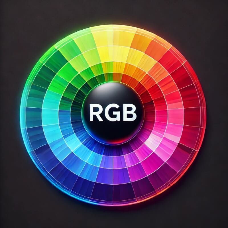
RGB color wheel: Ideal for digital displays and online designs.
Why Choose CMYK for Mass Production?
CMYK (Cyan, Magenta, Yellow, and Black)
For your mass-production cosmetic packaging, we highly recommend the CMYK color model (Cyan, Magenta, Yellow, and Black).
This subtractive model works by blending these four inks to create a wide range of colors, ensuring rich, vibrant hues on paper. Printed images consist of patterns of dots made up of these four specific colors. CMYK is ideal for achieving consistent and accurate color reproduction, making it the perfect choice for large quantities of cosmetic packaging.
With CMYK, you can rest assured that your packaging will look fantastic on every shelf.
If your design requires a specific solid color, you might need to use a custom-mixed Pantone color. While CMYK can reproduce many colors, some PMS (Pantone Matching System) colors may require running a separate ink in your print job, ensuring that your packaging stands out with the precise shade you envision.
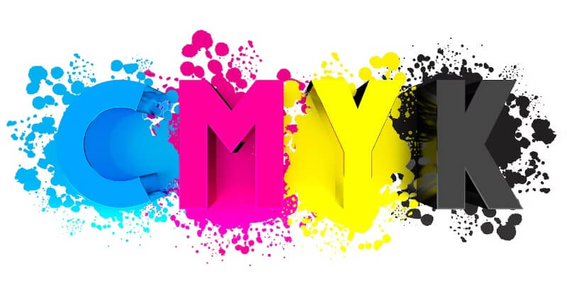
CMYK model: Essential for vibrant and accurate full-color printing.
The Importance of Pantone for Brand Consistency
PMS (Pantone Matching System)
If maintaining brand consistency is your priority, the Pantone color system is your best bet. PMS colors are standardized shades that ensure the same color is reproduced every time, regardless of the printing method.
Printers often refer to “PMS colors” or “spot colors,” which are applied in solid layers rather than the tiny dots created by CMYK blends.
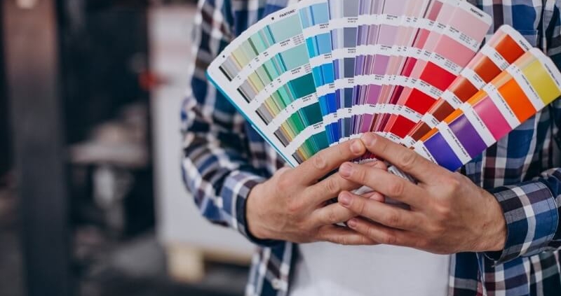
Customers can select PMS colors using swatch books that display every solid PMS color, making it easy to choose the exact hue you need. With over 1,800 solid PMS colors available, this system is crucial for cosmetic brands looking to create a strong, recognizable identity.
Using Pantone colors allows you to maintain uniformity across different products and marketing materials, making your brand instantly recognizable.
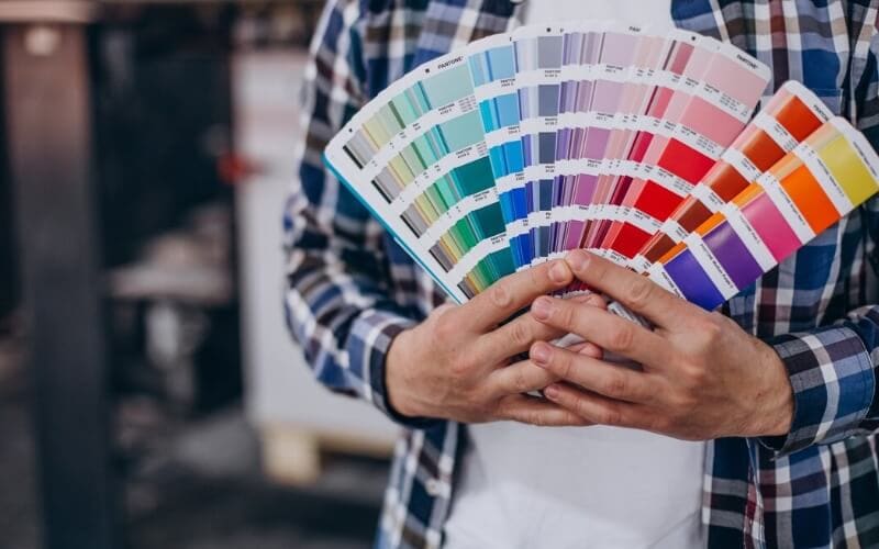
Pantone swatch book: The standard for precise color matching in print.
Conclusion
Understanding the differences between RGB, CMYK, and Pantone colors is vital for effective cosmetic packaging design. For large-scale production, CMYK is the optimal choice, while Pantone ensures brand consistency. At Custom Beauty Box, we are dedicated to helping you achieve your packaging goals with the right color solutions tailored to your brand’s needs.
For expert advice and to elevate your cosmetic packaging,
visit us at Custom Beauty Box.
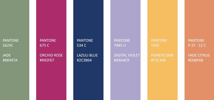
Pantone color options: Ensuring brand consistency with standardized colors.
By optimizing your packaging design with the right colors, you’ll boost your brand’s visibility and impact in the competitive beauty market.

